Skip to content
Search for:
Primary Menu
Projects
Exhibitions
Extracurricular
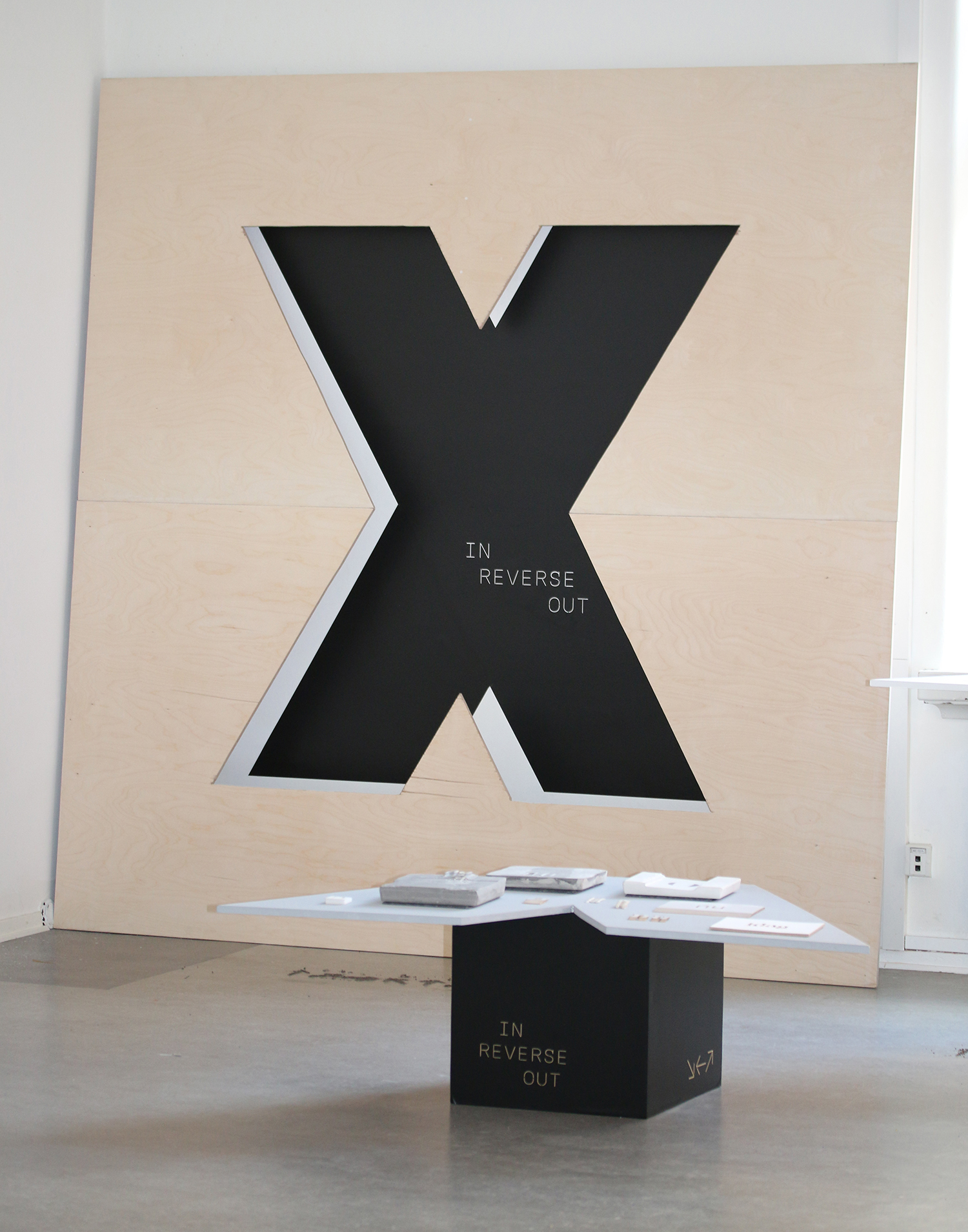
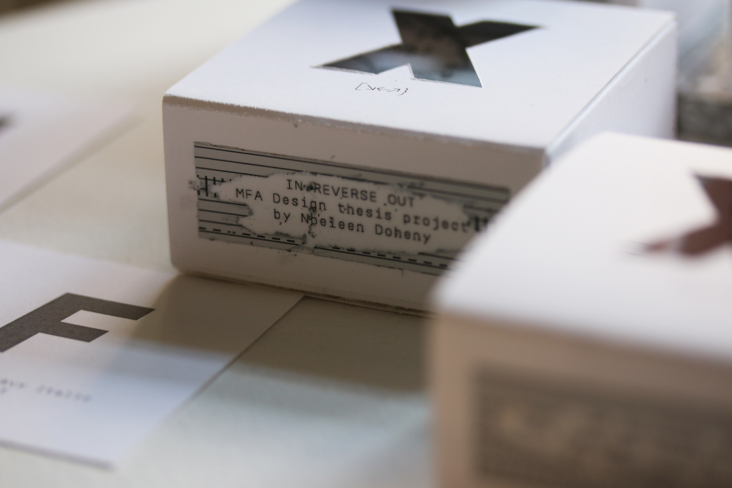
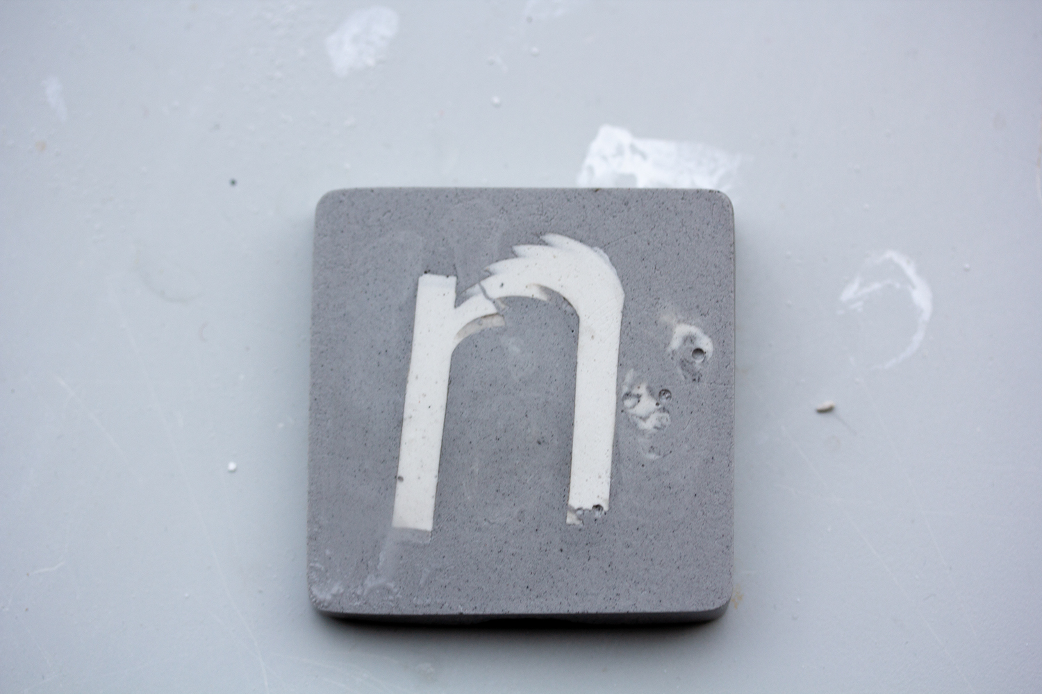
In Reverse Out
MFA Design Thesis Project
Now and Then
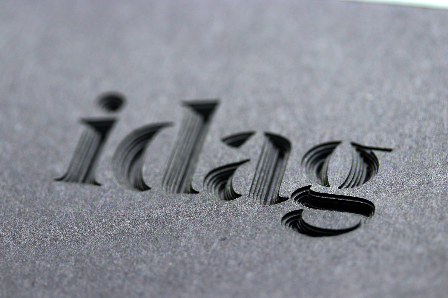
From 2D to 3D: Articulating an idea through paper
Motion in a Static Object
Activating a Conversation
Thesis Presentation
Portfolio
About
Featured
Illustration
Typography
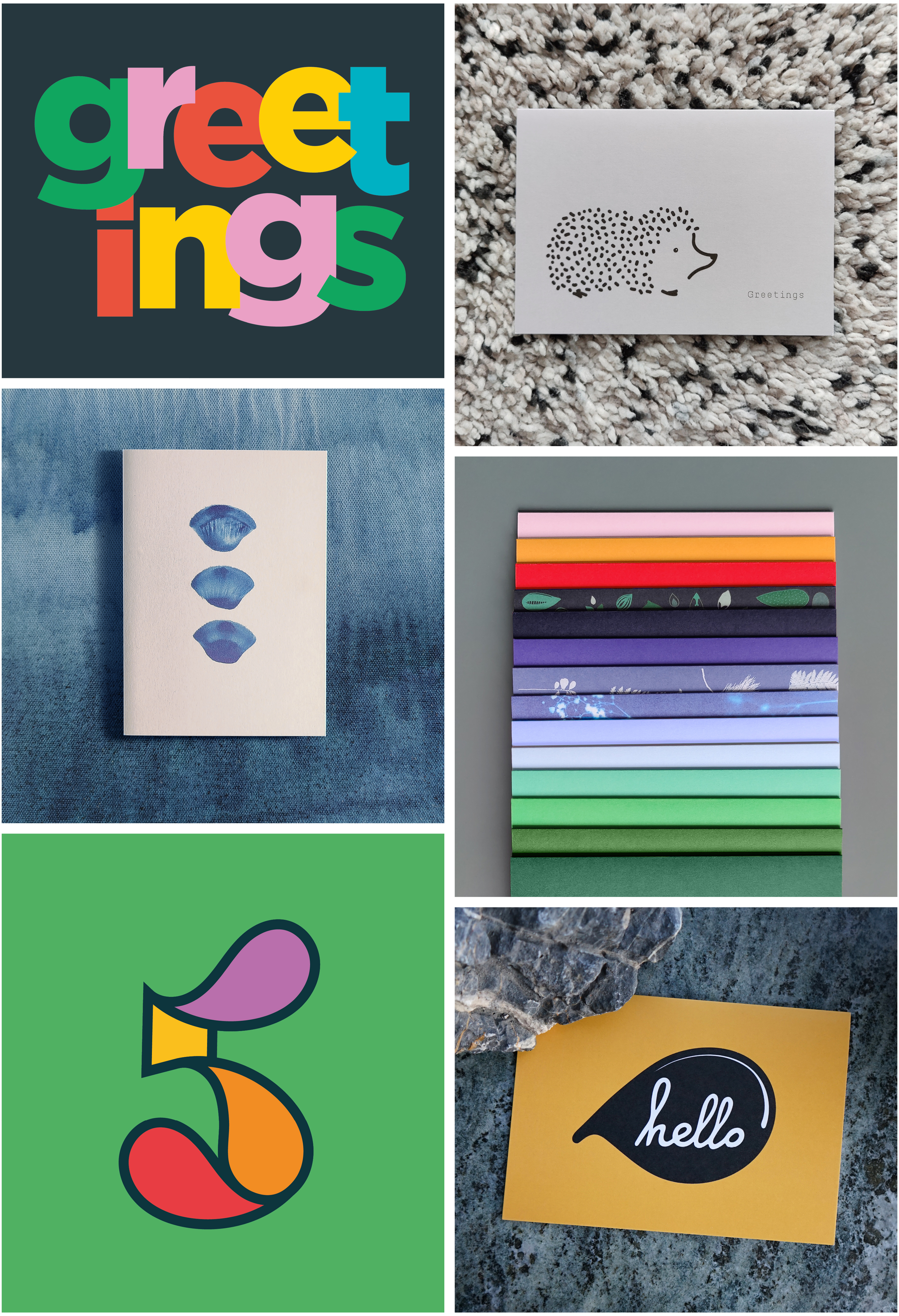
Greeting Cards
Featured
Illustration
Typography
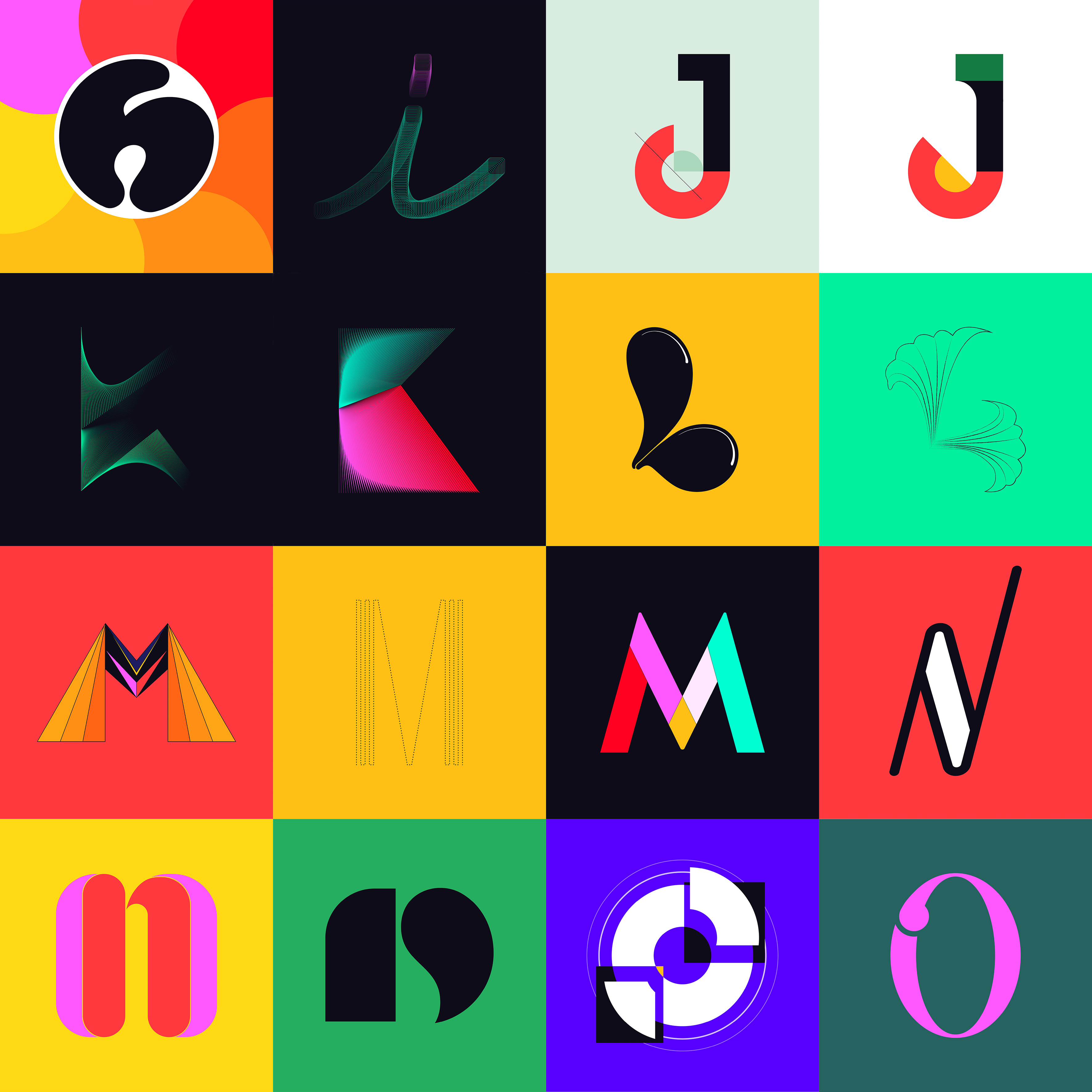
36 days of type (09)
Featured
Photography
Typography
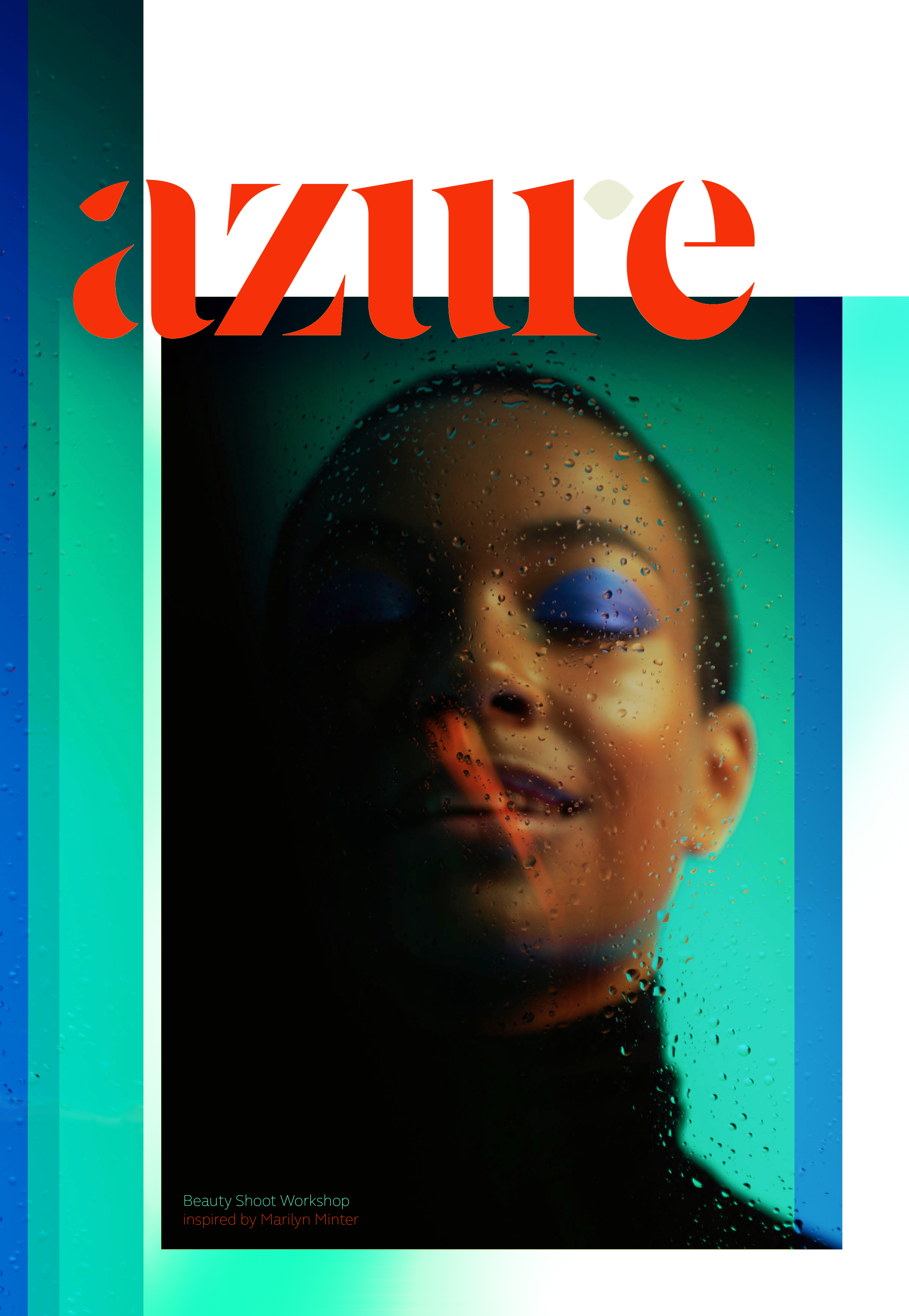
Beauty Photoshoot
Featured
Photography
Uncategorized
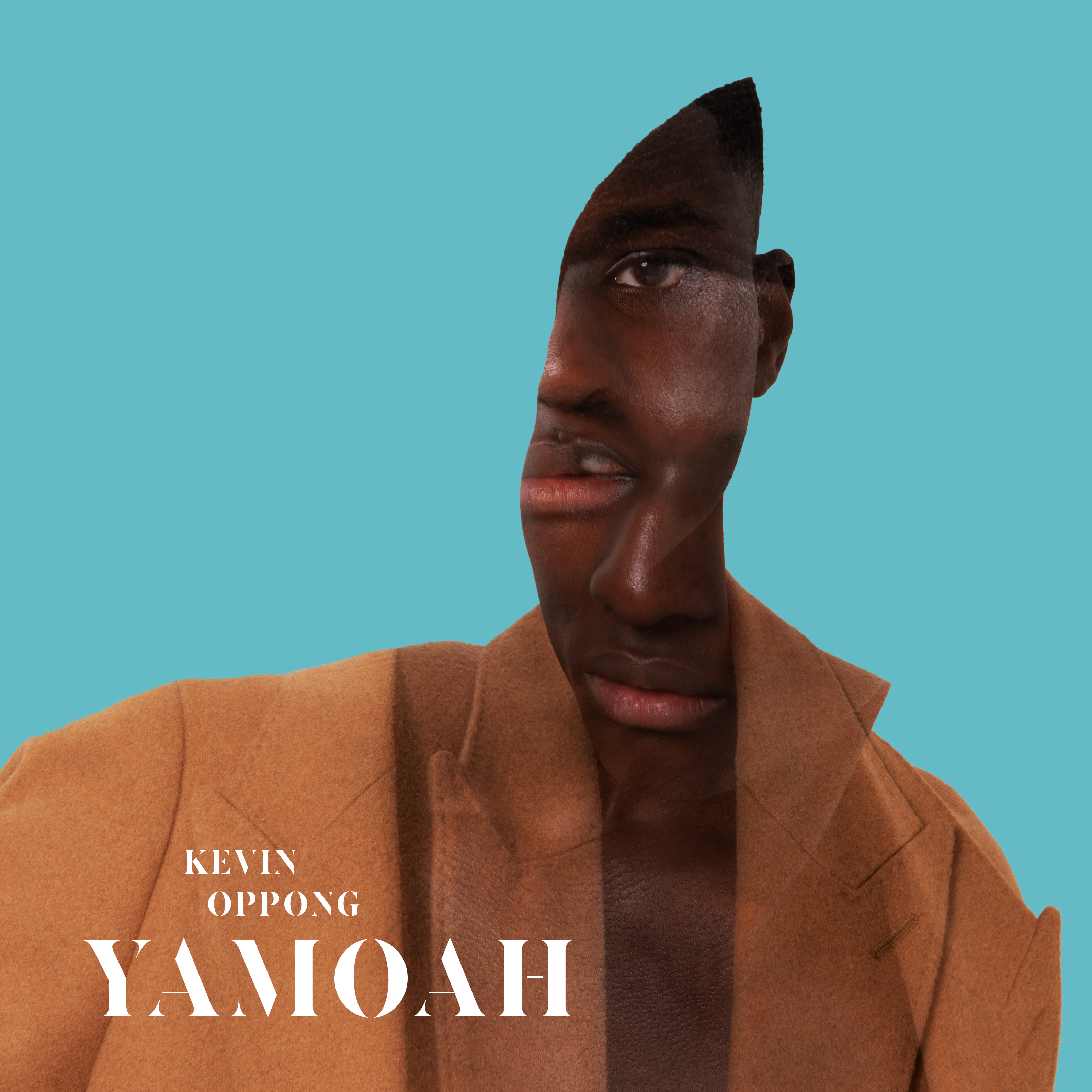
Double Exposure
Extracurricular
Typography
SOON
Exhibitions
MFA Design
Projects
Typography
Thesis Presentation
MFA Design
Projects
Typography
Activating a Conversation
MFA Design
Projects
Typography
Motion in a Static Object
MFA Design
Projects
Typography
Now and Then
MFA Design
Projects
Typography
From 2D to 3D: Articulating an idea through paper
Page navigation
1
2
3
4
Next