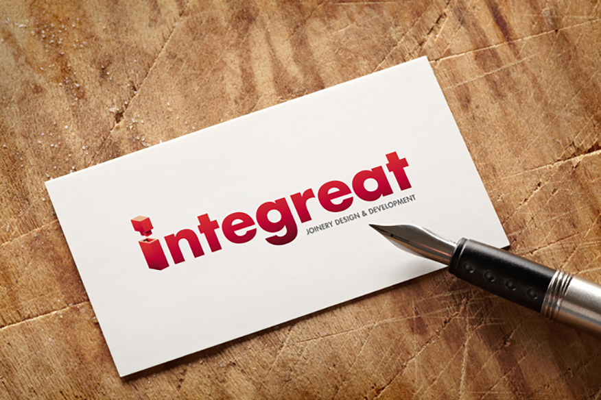
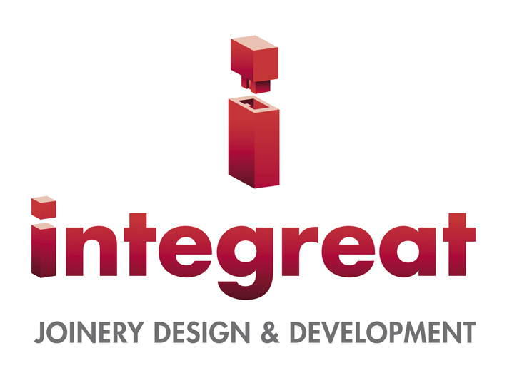
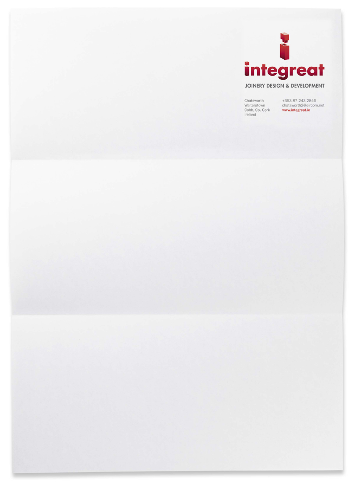
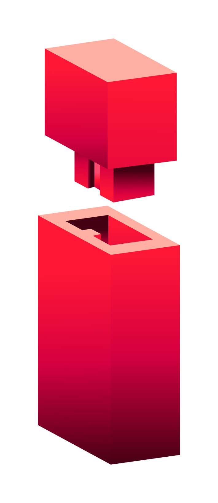
This project involved name generation and logo design and roll out for a joinery company. I worked on this while at Huguenot. Since joinery is all about well crafted components that make up a building, the ‘perfect fit’ and ‘click into place’ themes were visualised using the letter i / first letter of Integreat. The tittle of the i character looks like it could be clicked into the stem of the letter. There is a portrait and landscape version, to accommodate for the i symbol, when applied at smaller sizes.
