This post is part of a series of posts that explain aspects of my MFA Design Thesis project. To read more about the project please visit the website.
As part of my compiled thesis, I share an in depth description of one of the instrumental methods used within my project. This method was called From 2D to 3D: Articulating an idea through paper.
My project is a physical material investigation that challenges me to build on my existing graphic design skills which are mainly computer based and with a two dimensional printed output. The following method was used to help me to understand, articulate and create movement of typographic letterforms within the 3D physical static material of plaster. The overall project recognises its designer’s inexperience with plaster, so this method was vital to the project’s progress and development. Instead of using my familiarity with Photoshop or Illustrator to graphically represent an idea, I built physical prototypes of my concepts to test the feasibility of my ideas and discover any unforeseen weaknesses that my graphic representations could not uncover or predict. With no prior experience designing physical, 3-dimensional letterforms, in any 3D software or CNC machines, I started making my prototypes using a substrate I was very familiar with; paper. I wanted to be able to approach experts from other design disciplines within HDK for advice and guidance. By bringing a physical prototype with me, I could more easily clarify what I was trying to create and avoid using incorrect terminology. I used this technique previously in the first year of my master’s course when I constructed a 3D decagon using paper, in order to clarify with the wood workshop staff what I wanted to make.
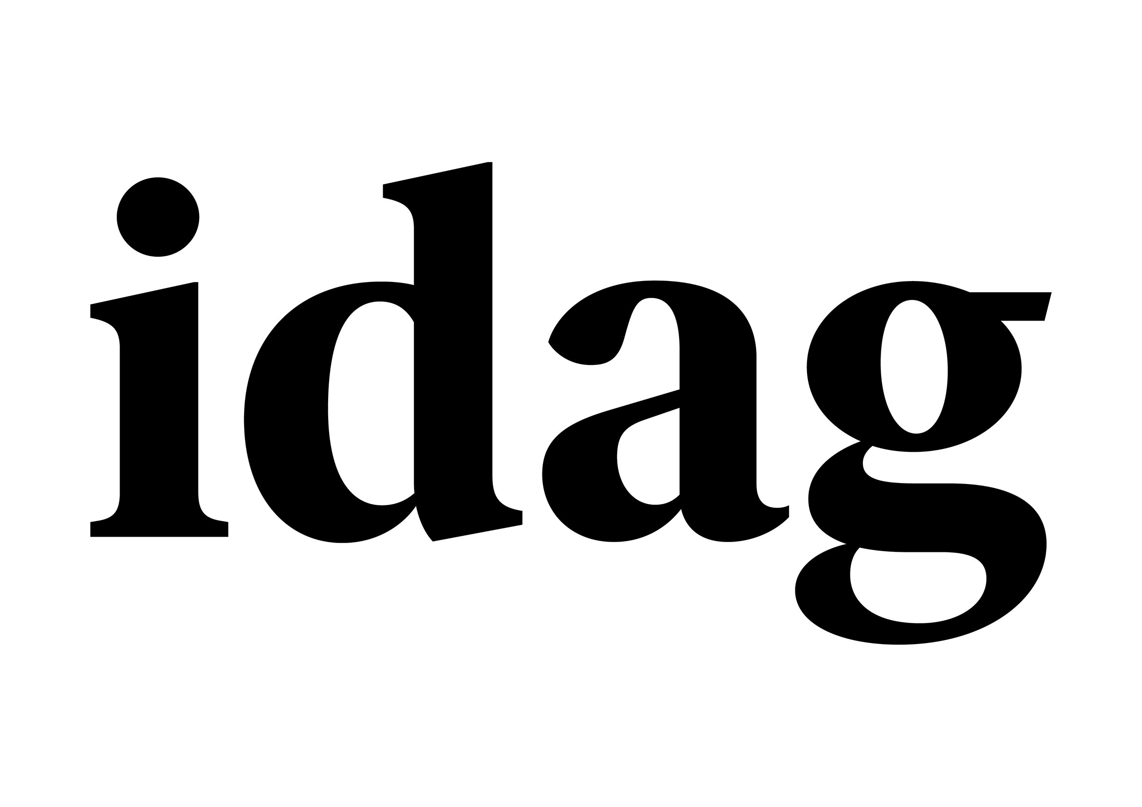
Before building a paper prototype this time, I tested my typographic ideas visually on the computer screen. Using the word idag (meaning today in Swedish) I created outlines from the typeface Ivar Headline and incrementally increased the negative value of the offset path on the outlined type until it disappeared. With one incremental change on each layer, I then moved the work into Photoshop where I created an animated gif to observe the moment legibility was gained and lost.
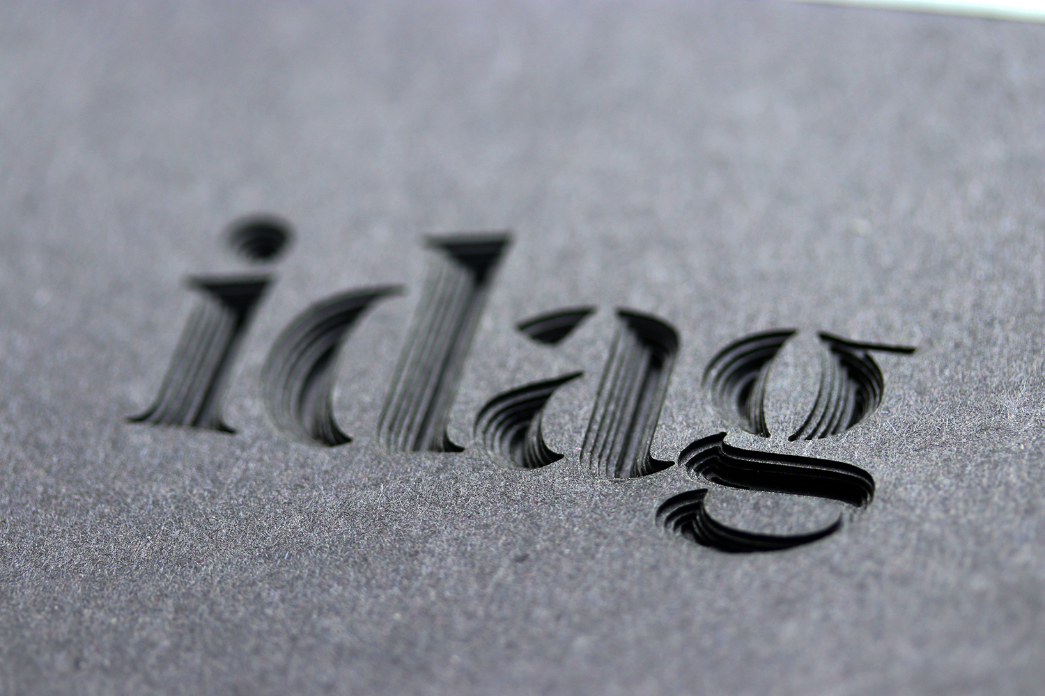
The next phase was to reformat the work from the computer screen into paper. To use paper, I had to change the font to its stencil version, Ivar Nostalgi Stencil. I cut each layer from the Illustrator file into paper, using the laser cutter. Then, I layered each piece of paper, so that I could observe and reflect on the gradual disappearance and or reappearance of the letters.
 These digital layers were created for the laser cutter and turned into an animated gif for me to view the moment legibility was gained and lost.
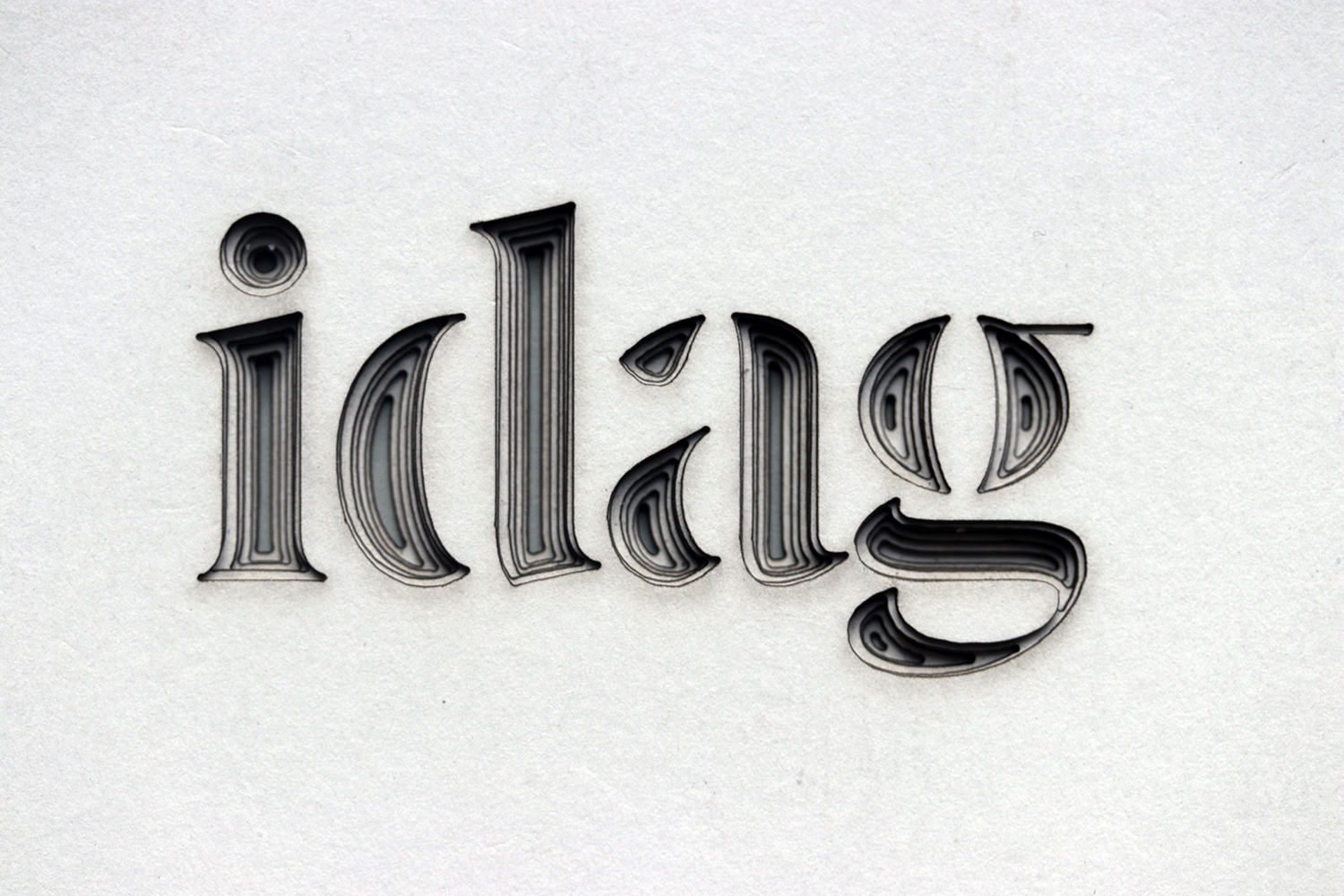
Laser cut letterforms layered in order of legibility on white card (above) and black paper (at the top of this page).
I used these paper mock ups to discuss the inside and outside of letterforms at my first review of semester 2. Looking at the negative space within these examples I started to devise ways of creating moulds that allowed letters to fade away or emerge. Using the laser cutter again, I began cutting the number zero from its full shape down until it was almost nothing and started to create moulds using spackle, silicon spray and alginate.
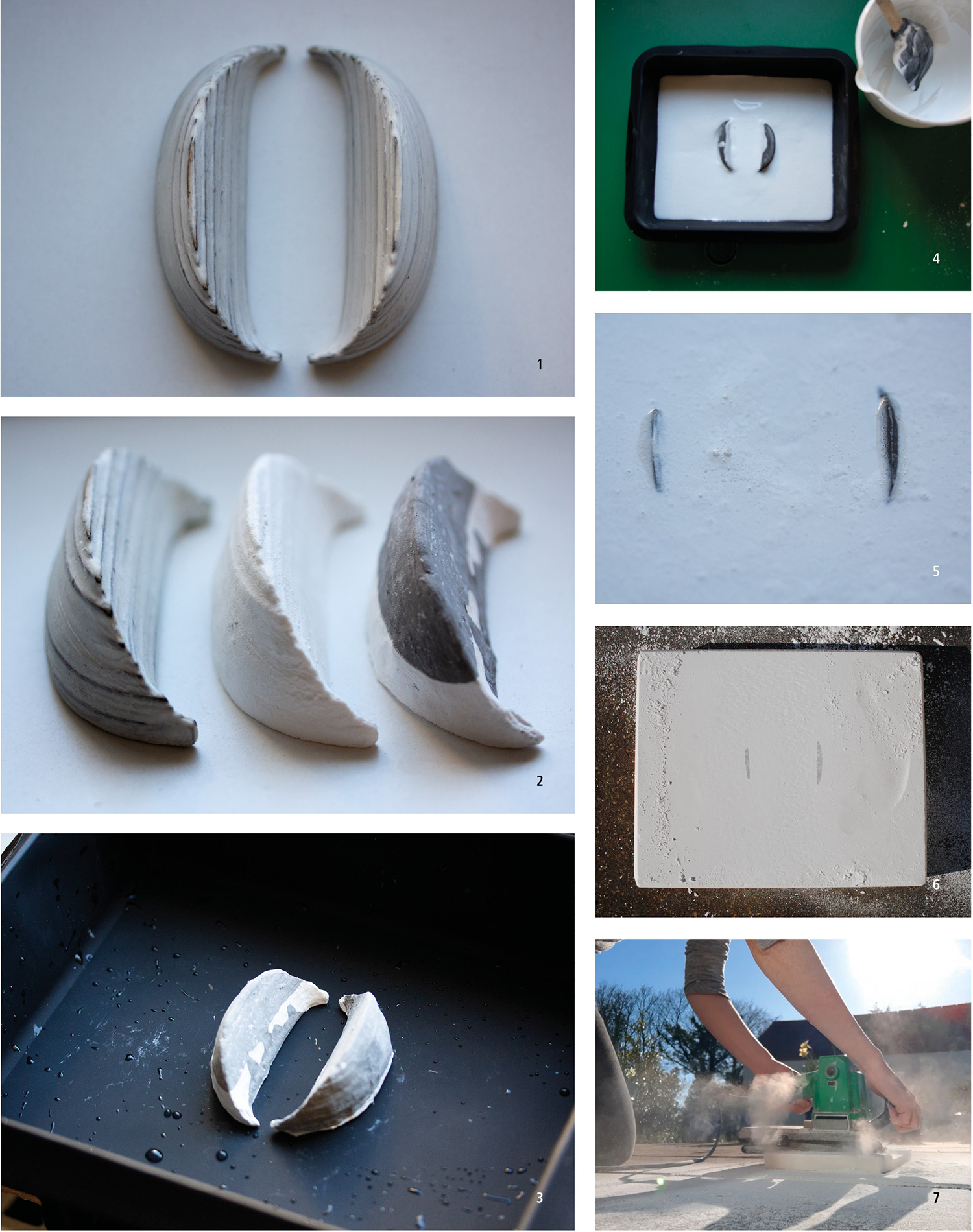
1. Mould made by cutting aeroply in the lasercutter, filling in gaps with spackle, and waterproofing with silicon spray to make alginate moulds. 2. Aeroply mould from #1 beside plaster reproductions from that mould. 3. Zero mould placed into silicon tray. 4. Filling the silicon tray with white plaster. 5. A close up of the submerged zero. 6. Beginning to sand the top of the block. 7. Me, using an electric sander to cause and observe the zero figure emerging. Below: Zero beginning to get thicker/more legible.
After working out how to make a letter emerge from plaster, through erosion (sanding), I started to play with the notion of a word moving across the surface of a block of plaster. With no idea how to make a mould for this ‘typography in motion’ concept, I used the older technique of moulding, from the zero concept, before approaching the ceramics department in HDK. By having a physical articulation of what I was trying to create, in paper, I was able to display and discuss my rudimentary techniques and eventually managed to obtain some excellent advice from one of the students there. His advice was to make a mould using the negative space of the letter instead of the positive space. From there, I was able to make the letter n move across a small block of plaster.
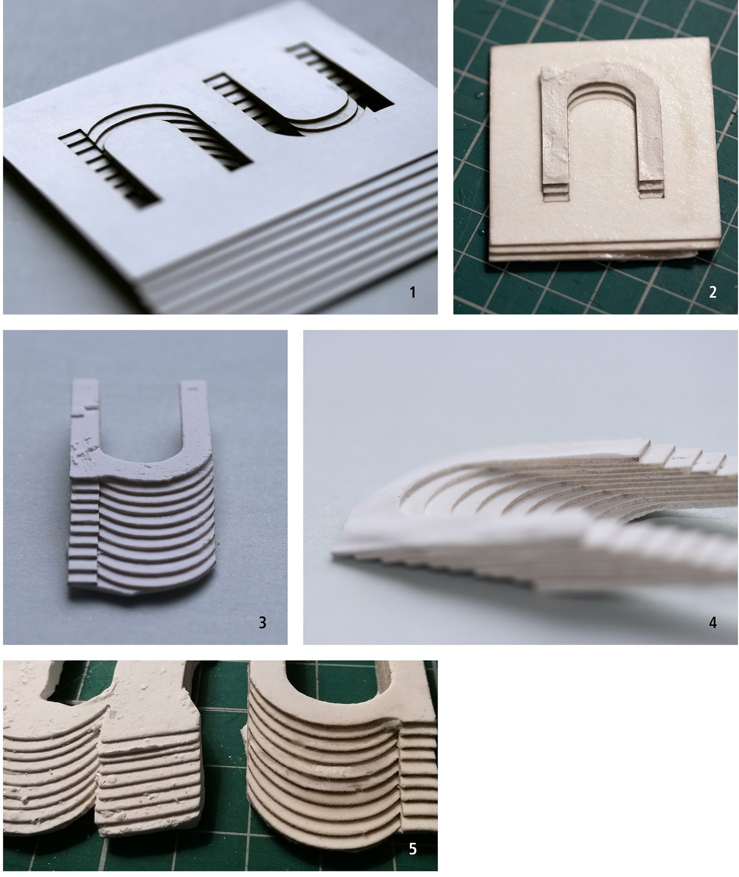
1. Paper mould created by lasercutting the same letterform over and over again and layering it at equal intervals. The mould is a negative space of the letter which was a departure from my approach for the number zero. 2. Plaster set inside the n shape of the paper mould. 3 & 4. Close ups of the plaster, when released from the paper mould. 5. Early and more developed mould trials.