This post is part of a series of posts that explain aspects of my MFA Design Thesis project.
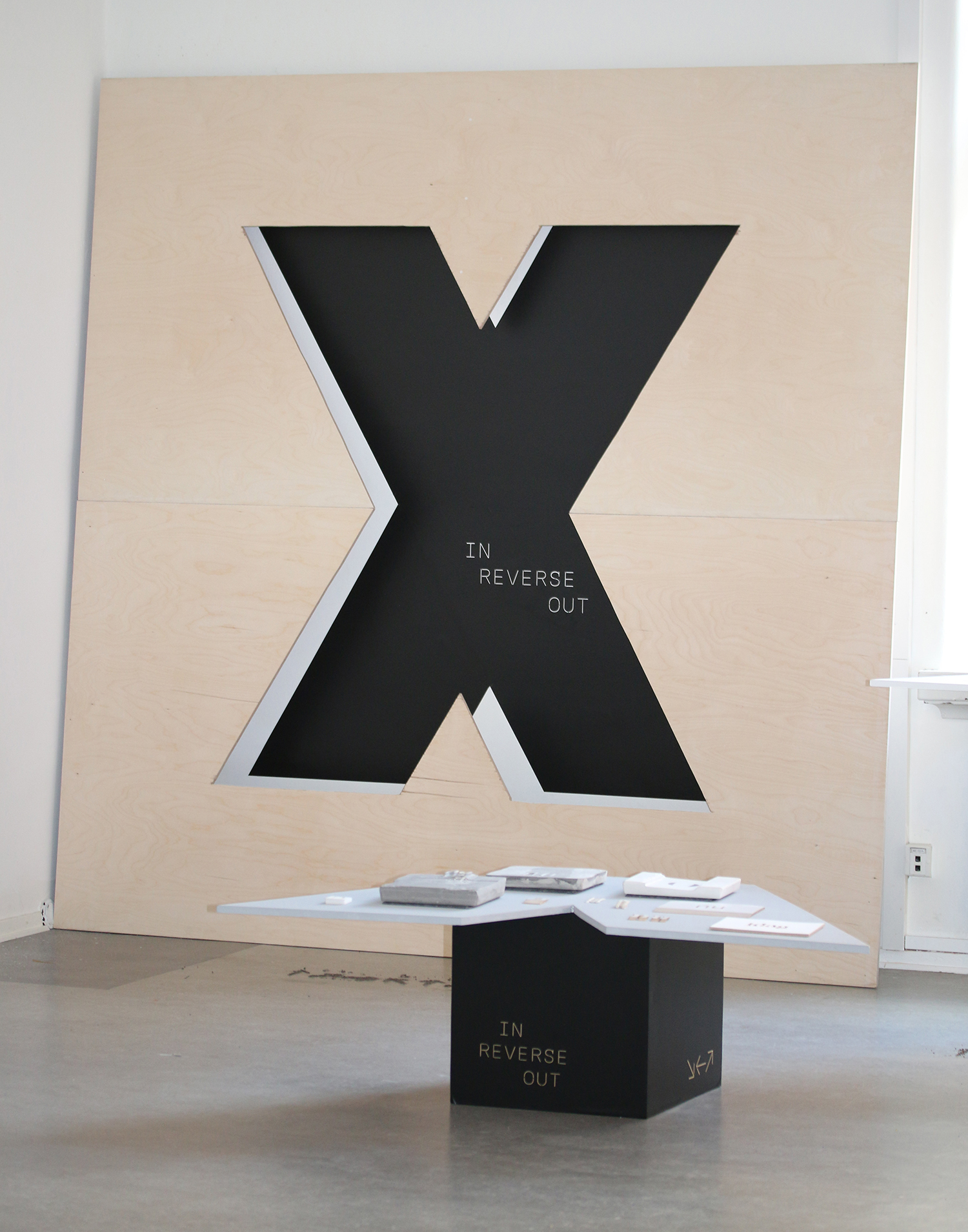
I made a 2.4m² stencil of the letter X and tagged the wall behind it, for my final review of my masters project at HDK. I wanted to give the stencil the most prominence in the presentation, in order to visually demonstrate the importance and value I have for the experimental and improvisational phase of my thesis project. The outcomes of the project were presented on two smaller tables that used the negative space from the stencil’s production.
As the project evolved, it started to become clear to me that my contribution would be directed at the field of Visual Communication. A field I planned to re-enter upon the completion of my studies; leaving the security of the education system. I came back to college to be able to compete with my contemporaries, in a bid to stay relevant. Instead, I developed a way to understand the benefits of my current skills. My aspiration is for my skills to complement rather than compete with those I work with in the future. For the designers I surveyed earlier in the year, I wanted to share my approach towards developing my skills and interrogating my own assumptions.
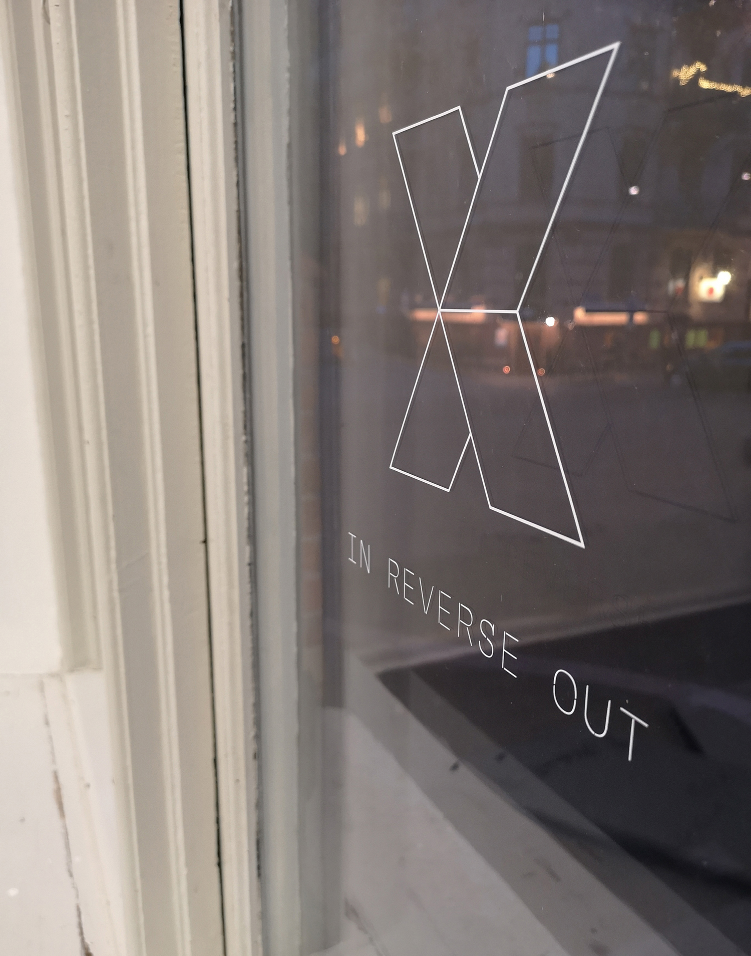
Using the title In Reverse Out, a printing term that refers to printing everything but the letterform, I thought that this held together the strategies I had created for myself in the past few months.
The letter x is heavy with meaning. I decided to use it as a way to silently represent the word wrong. To actively practice an openness to being wrong has been the key to discovery and confidence within my new form of practice.
To read more about the project please visit the website.
Looking outwards from inside the school, considering future practice and the industry I would return to.