This post is part of a series of posts that explain aspects of my MFA Design Thesis project.
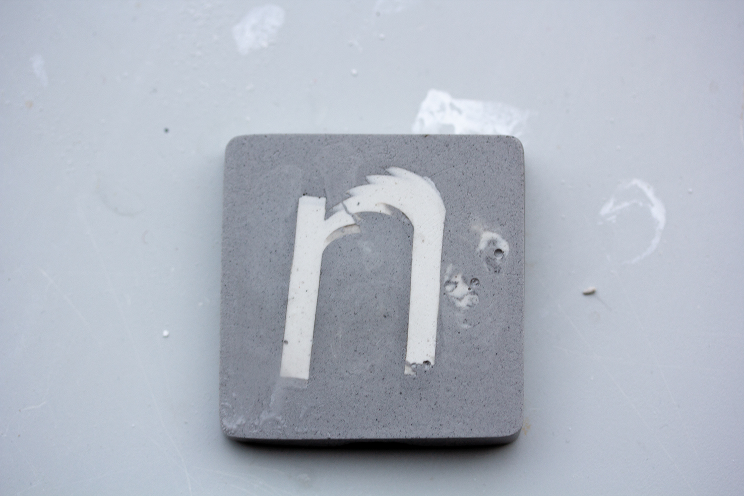
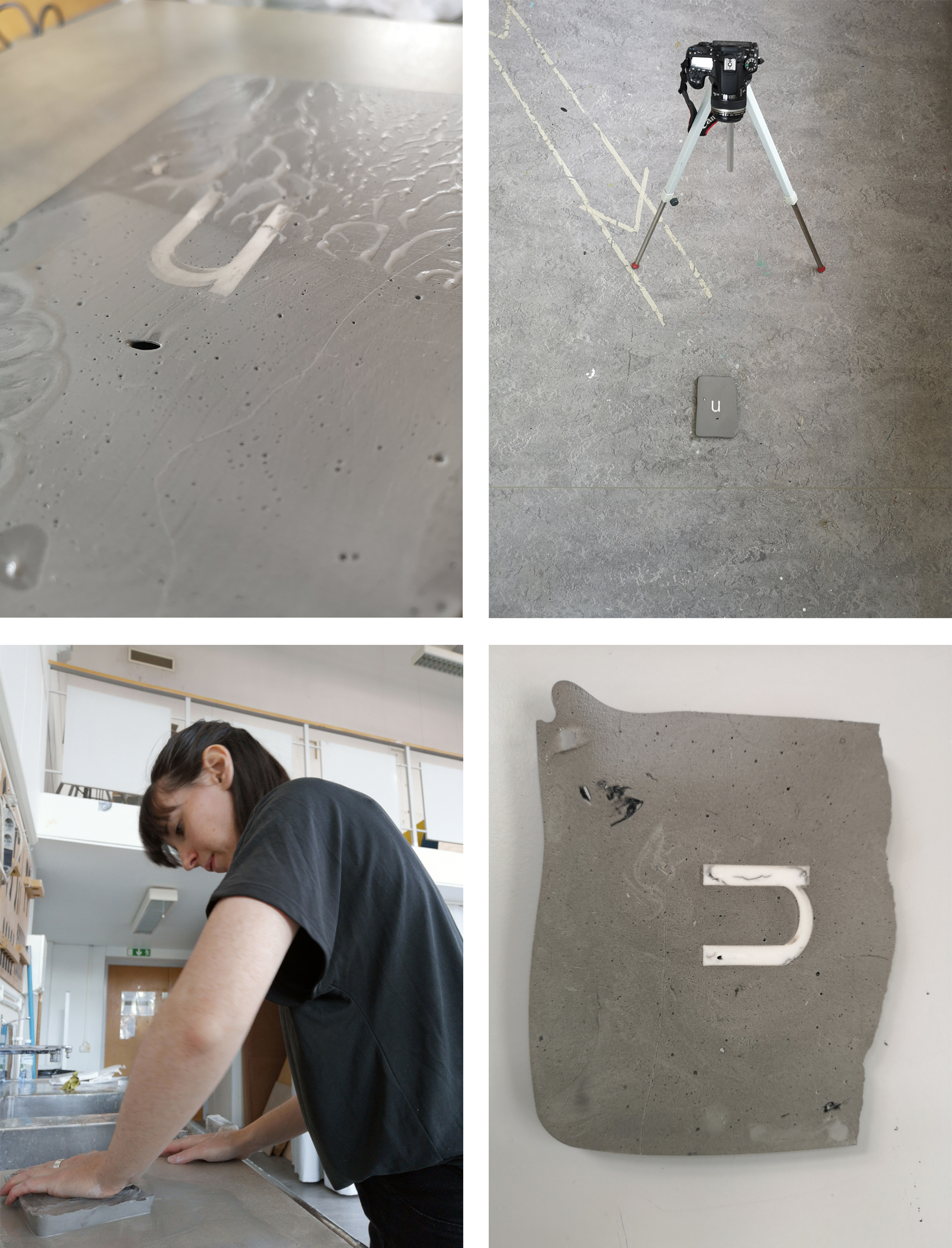
Above you can see the letter n within a block of plaster. This was a test. As I write this thesis I am creating a larger version with the letterforms n and u. I chose the typeface Mikro, by Letters from Sweden because the n and u are the same when rotated and therefore the word nu can be read at 0 and 180 degree rotation. Through manual sanding, the letter n moved down the surface of the block above. Essentially what I was doing was reformatting an animated gif into a static object.
For my final review, I intended to share proof of this moving typography by photographing the block 97 times and creating an animated gif. While making the gif I realised that it was the piece’s second iteration of an animated gif. Essentially I was using my existing knowledge of digital software to inform the behaviour of a material that I had very little knowledge of.
I chose to film the animated gif being built in Photoshop to acknowledge myself, the author of the work. I was doing this to demonstrate my agreement with the following quote by Paul Elliman; “We exist and move and even walk and move under the conditions of our time.”
It was only now that I could appreciate or more fully recognise that I am a product of the time I grew up in and the time I trained to be a graphic designer. My way of working is quite different from visual communicators that have come before and after me. It is my belief that the industry is richer if there is diversity in skills, methods and experience. In order to maintain this diversity there were certain aspects of the graphic design industry that I needed to address.
To read more about the project please visit the website.