This post is part of a series of posts that explain aspects of my MFA Design Thesis project.
It started to become clear to me what my contribution would be, to the visual communications community. I came back to college to be able to compete with my contemporaries, in a bid to stay relevant. Instead, I developed a way to understand the benefits of my current skills. My aspiration is for my skills to complement rather than compete with those I work with in the future.
For the designers I surveyed earlier in the year, I wanted to share my approach towards developing my skills and interrogating my own assumptions.
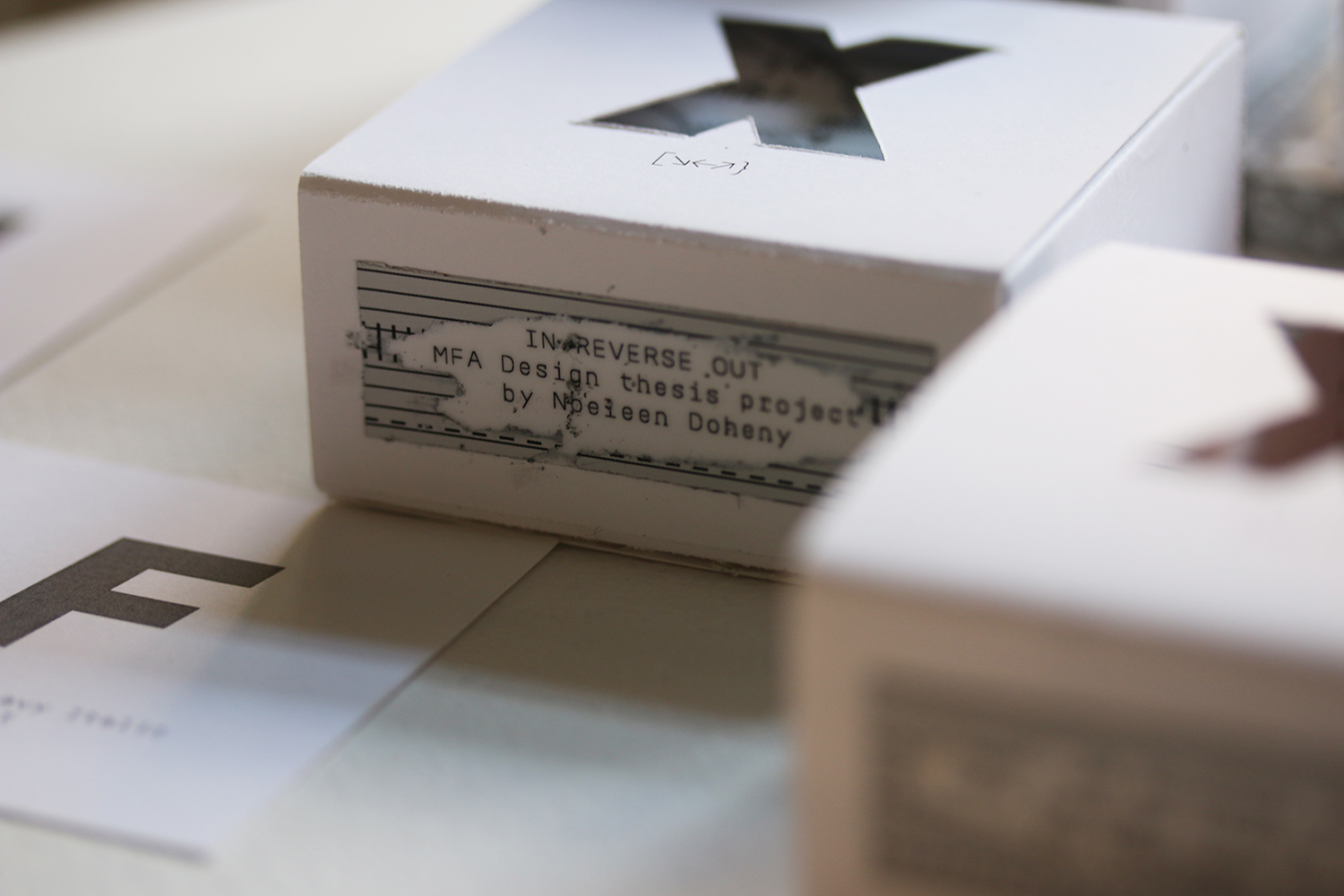
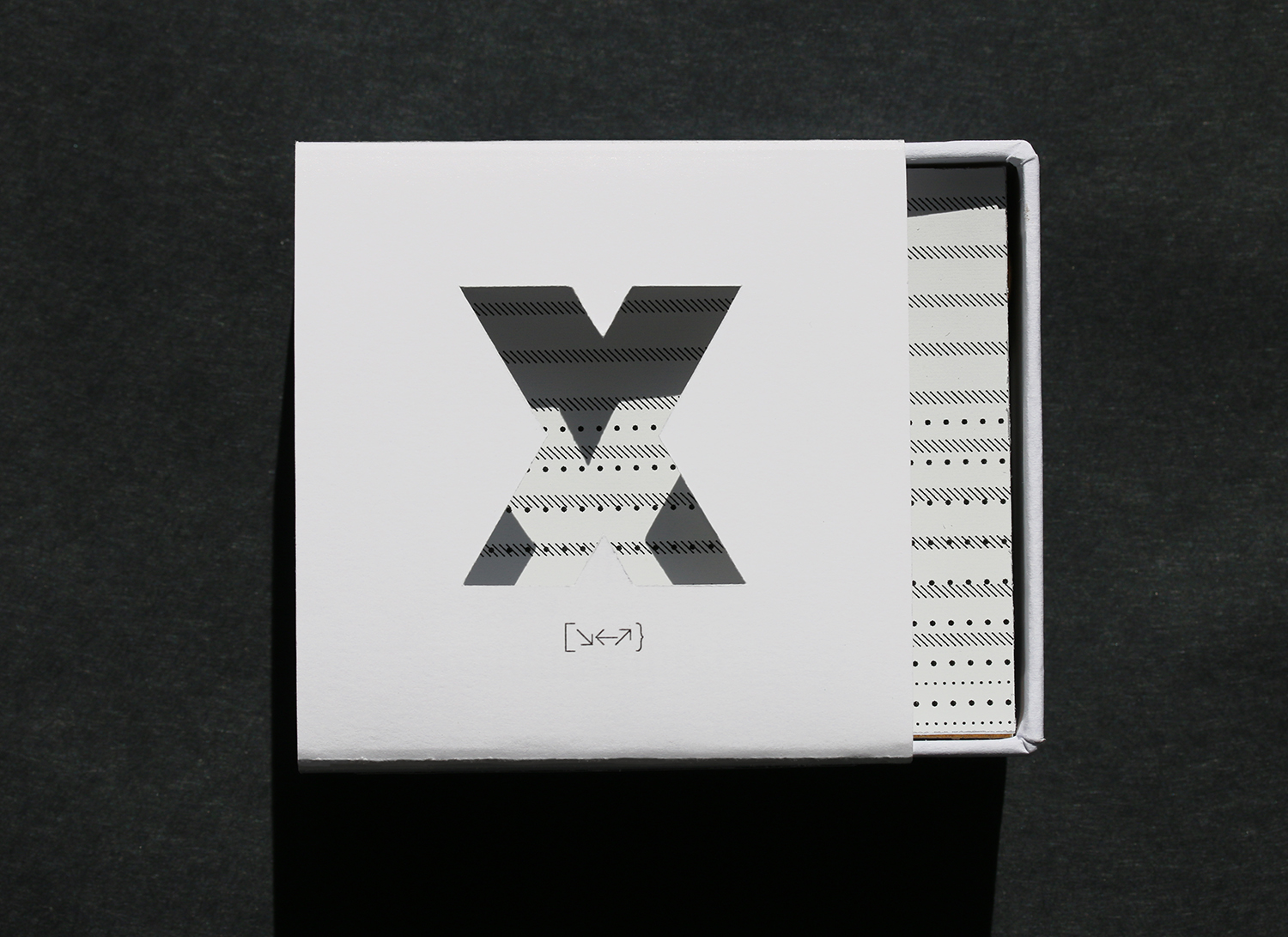
Using the title In Reverse Out, a printing term that refers to printing everything but the letterform, I thought that this held together the strategies I had created for myself in the past few months.
The letter x is heavy with meaning. I decided to use it as a way to silently represent the word wrong. To actively practice an openness to being wrong has been the key to discovery and confidence within my new form of practice.
I wanted to share a conversation starter, with the participants of my questionnaire. These very small boxes were created to share with those designers some of the realisations I had had over the past year about materials, perfection/failure and time.
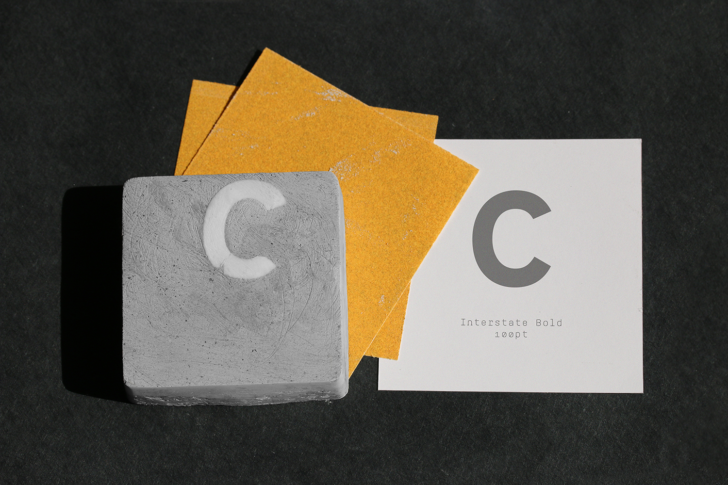
As part of the questionnaire, without explaining why, I asked the participants to choose one letter or number that resonated with them. As a token of gratitude, I created a small 7cm² plaster block with their chosen letter or number inside, layered and ready for them to activate movement, like I had previously done and demonstrated in my Method Description.
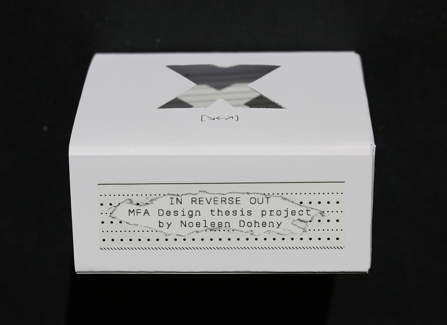
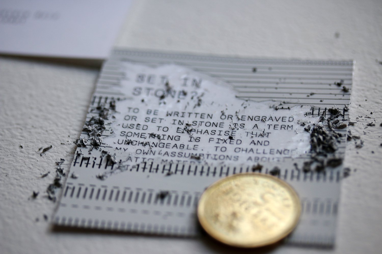
Along with the plaster block, inside the box, were additional objects that were there to help the user to activate movement and uncover hidden information. The contents of the box also included a coin, paper and sandpaper. It is intended that before the user realises that they should sand the plaster, they must reveal the text hidden within the paper, using the coin. This text invites them to activate movement through sanding. To give hints as to which surfaces to scratch, the same pattern of dots and lines was used. In the image on the bottom left, this scratching effect is demonstrated on the outside of the box.
On the back of the box, there is a signpost to more information, should the receiver be curious to learn more. They are directed to a website I created at the address inreverseout.com. The website, like this compiled thesis shares a lot of quick trials, refined trials, my pre-study project and so on.
These boxes were not sent out before the completion of this thesis. As previously mentioned, I struggled a lot to identify what my role or contribution was while working on this project. With that said, these boxes will be sent out in June 2019. Knowing the tendencies of a lot of graphic designers, I realise that a lot of the recipients might not want to sand the block but if they don’t want to, they will be able to see what it would look like, by visiting the website.
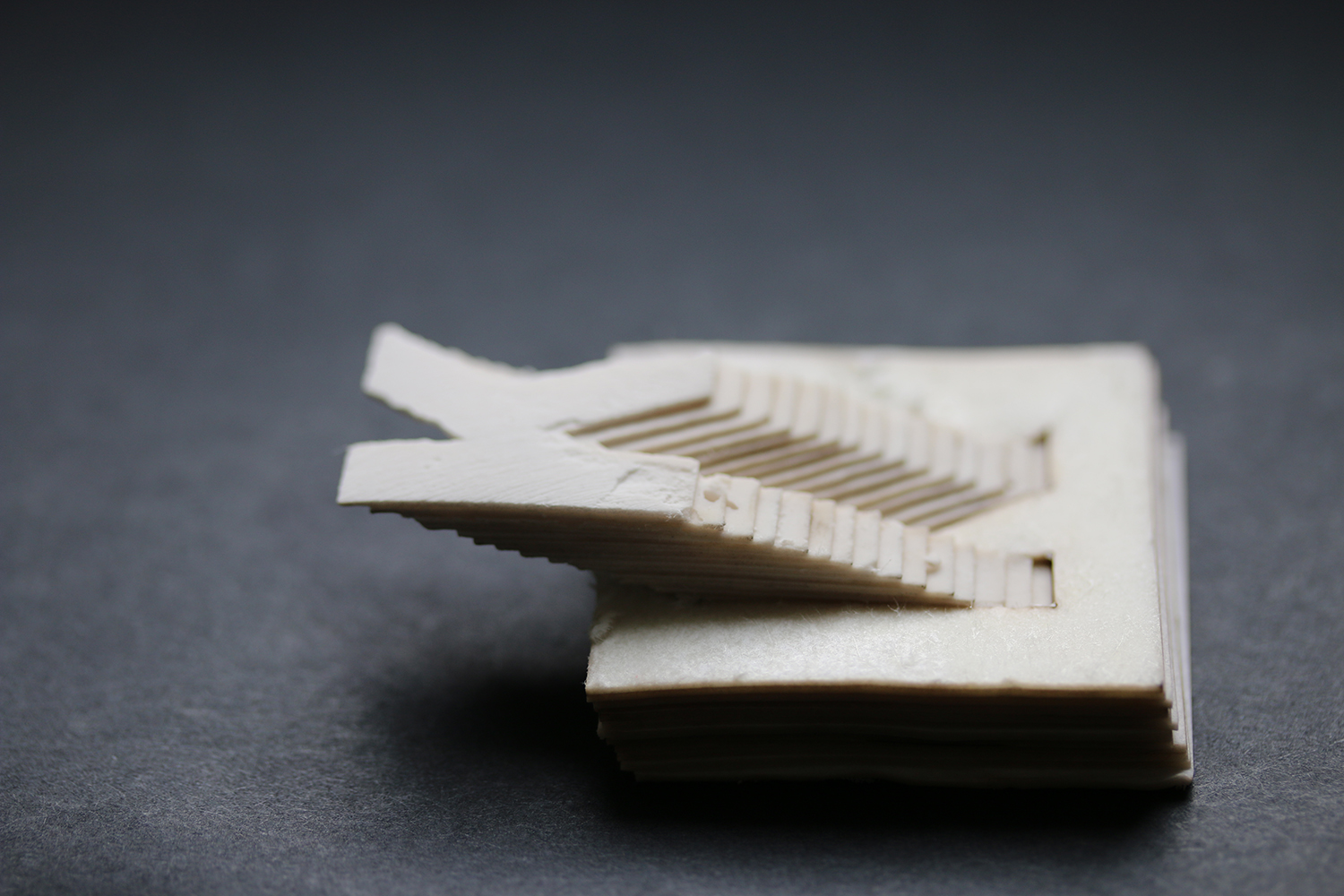
The letter K, before it has been set in the grey plaster. Custom made for one of the participants of the questionnaire.